Reflextion
1. i believe i did good on getting my point across because i laid the truth right out there.
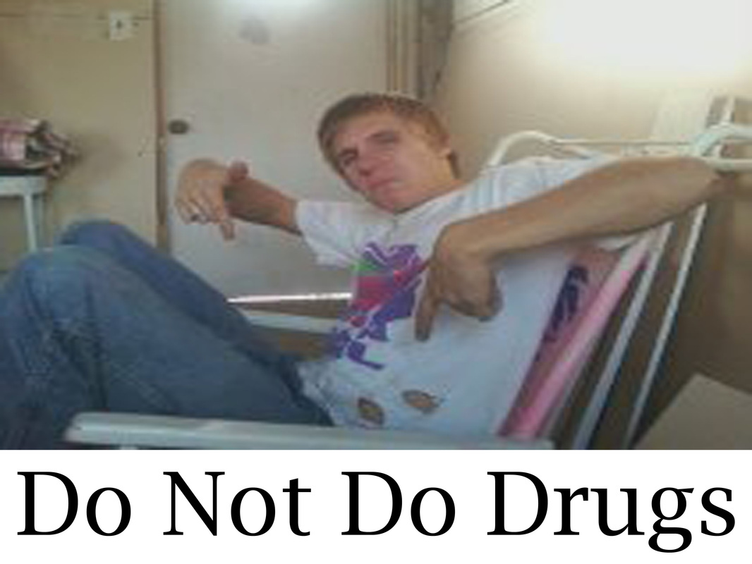
2. i believe i couldve put a little more time and effort on my second billboard because it's a little plain.
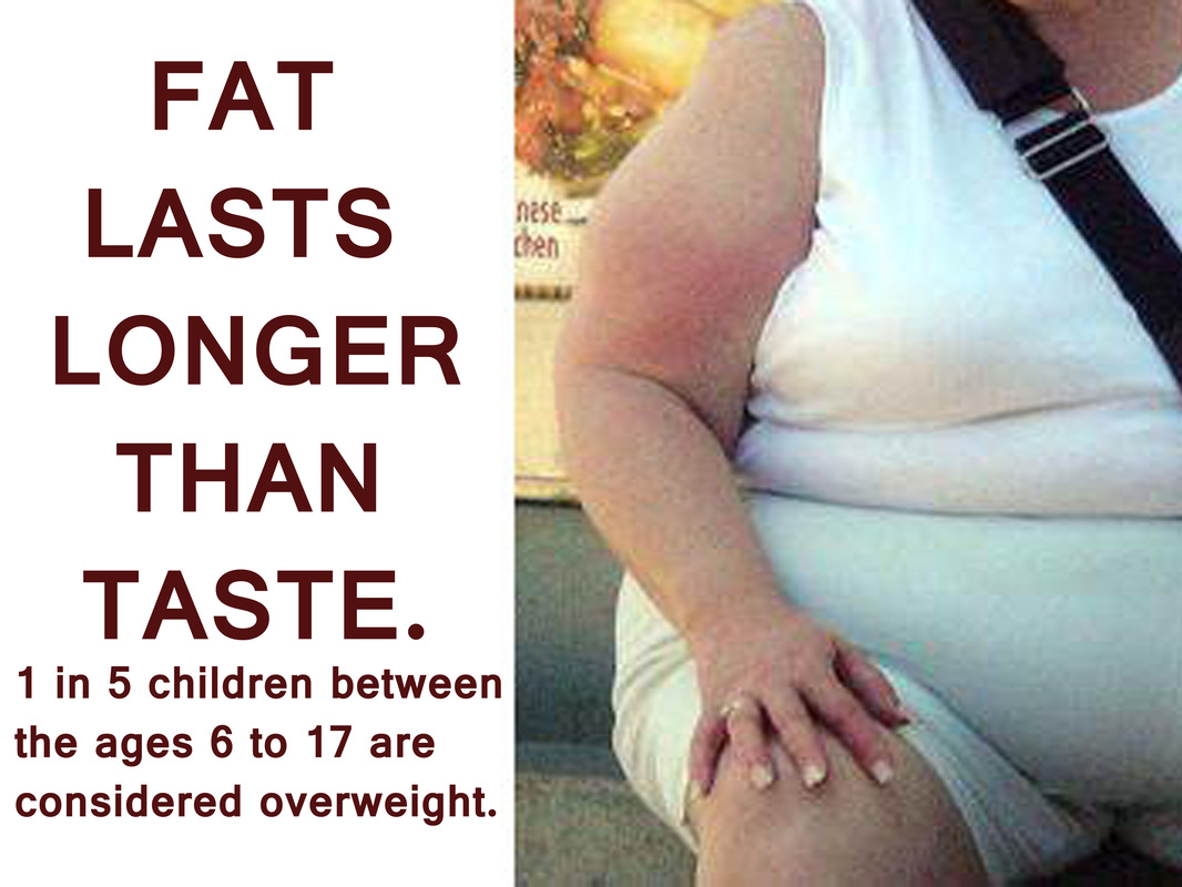
3. the theme of my billboard is to get people to realize that the human race is getting fat. the other one is to tell kids to stay away from drugs.
4. the colors in my first billboard is reds and yellows, warm colors, i fell it gets peoples attention driving down the road.
5. the points of emphasis is deffinatly the pictures, i used a gross one to let people know that fat looks gross, most the time.
6. i learned how to use adobe photoshop better and i will definalty use it in the future for other projects.
7. i saw this quote on pinterest and decided i wanted to target overweight people. so i googled "fatties" and got a photo that i thought got the most attetion without being too reveiling.
8. yes this project was worth my time. it's a good learning experience on how to edit stuff.
2. i believe i couldve put a little more time and effort on my second billboard because it's a little plain.
3. the theme of my billboard is to get people to realize that the human race is getting fat. the other one is to tell kids to stay away from drugs.
4. the colors in my first billboard is reds and yellows, warm colors, i fell it gets peoples attention driving down the road.
5. the points of emphasis is deffinatly the pictures, i used a gross one to let people know that fat looks gross, most the time.
6. i learned how to use adobe photoshop better and i will definalty use it in the future for other projects.
7. i saw this quote on pinterest and decided i wanted to target overweight people. so i googled "fatties" and got a photo that i thought got the most attetion without being too reveiling.
8. yes this project was worth my time. it's a good learning experience on how to edit stuff.